Concept
2026
Weee! Design System - Turning a fragmented interface into a shared design language
Weee!’s product had grown across cultures, categories, and features, but its interface had grown in pieces. More than 60 color values, 27 tag styles, several grid systems, and repeated component variations made everyday design decisions harder than they needed to be. As part of a four-person team, I helped create Umami: a proposed design system connecting foundations, reusable components, accessibility standards, documentation, and contribution guidance.

Overview
A shared system for a product that had grown in pieces.
Weee!’s interface had expanded through a series of one-off decisions. Similar components were recreated across flows; more than 60 color values were in use; 27 tag styles competed for attention; and several color combinations failed accessibility checks. We created Umami to turn those repeated decisions into reusable rules.
The scope was concrete, even though the system was not shipped.
These numbers describe what we audited and built. They are not presented as business impact.
60+
color value audited
27+
tag styles audited
21
consolidated color tokens
10
typography roles
252
tag combinations
40+
documented components and variants
System decisions
The strongest parts of the system came from deciding what each pattern meant.
Outcome
We finished with a stronger foundation and a clearer view of what was still missing
Umami connected the audit, foundations, components, accessibility guidance, documentation, contribution support, and final pitch. The outcome was a complete design system proposal, not a production rollout.
The case study tells the story. The artifacts let you inspect the system.
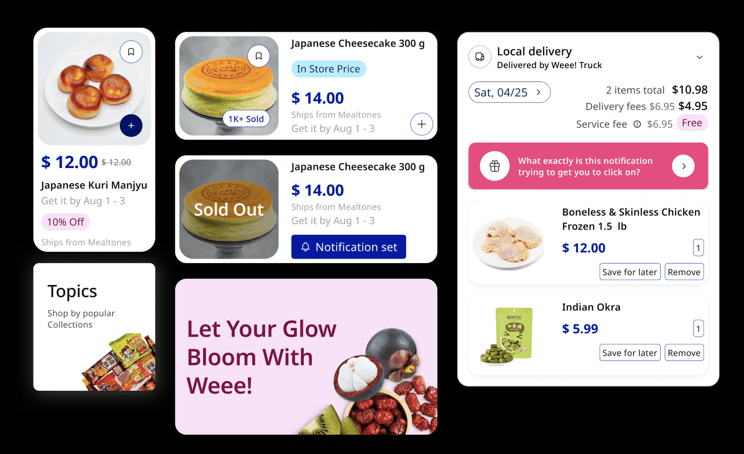
Each preview is built from the real Umami component structure: color foundations, tag variants, buttons, product cards, typography, and documentation.

Open the Figma System
Risk is ranked on load. Every row carries severity, cohort size, affected courses, and a direct Review action.
Open Figma library

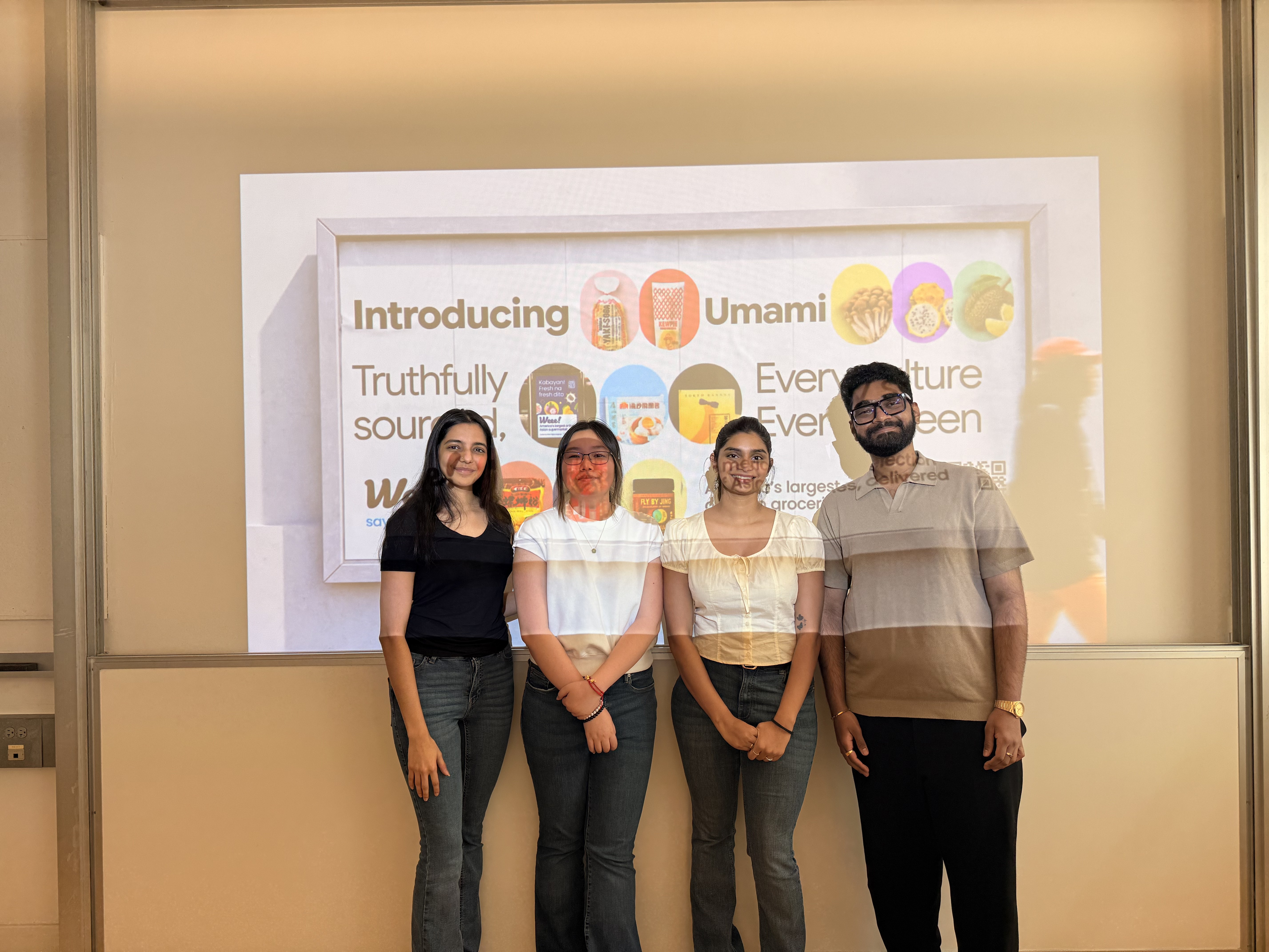
See how we presented the system
The pitch connects audit evidence, system principles, accessibility decisions, reusable components, and future recommendations
Open pitch deck

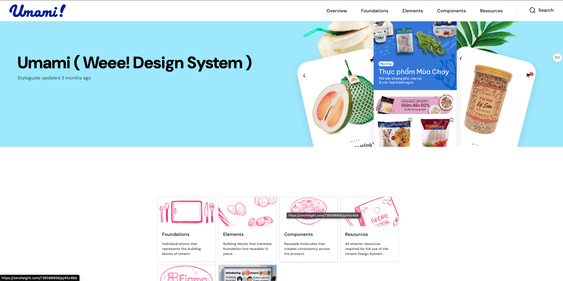
Read the Zeroheight documentation
Review component guidance, accessibility rules, contribution steps, resources, and release notes.
View Documentation
consolidated color tokens
21
named color families
7
semantic typography roles
10
supported tag combinations
252
These numbers describe the system we created. They are not evidence of product adoption, business impact, or design and engineering velocity.system
A connected design system proposal
Figma foundations, components, variants, and states
Zeroheight getting started and usage documentation
Accessibility and touch target guidance
Contribution guidance and release note structure
A tested revision of library coverage and organization
A design system works when the next person can understand the decision without having to ask the person who made it.
I started by treating consistency as a visual problem. Testing showed me it was also a dependency problem.
A library can contain every color, component, and state and still fail when its structure only makes sense to the people who built it. That changes how I judge the work: completeness was not the finish line.
Independent use was the real test of whether the system worked. A library was not complete simply because we had documented every component; it was complete only when another designer could find, understand, and apply those decisions without our help.