ERbuddy

2025

From medication tracking to shared care coordination

ERbuddy already tracked medications and appointments. I identified an underserved patient–caregiver communication gap, led the product strategy and multi-role architecture, and carried three core flows through seven moderated usability sessions.

Role

Design Lead

Timeline

4 Months

Team

2 Designers

Platform

Figma, FigJam, Miro

Role

Design Lead

Timeline

4 Months

Team

2 Designers

Platform

Figma, FigJam, Miro

Overview

What is ERbuddy?

ERbuddy is an early-stage health management app for patients and the people who support them. Its beta brought medication reminders, appointments, and medical history into one place. Our brief was to understand why families were not using it consistently and identify what the product was missing.

Product

A mobile app for managing personal and family health information.

Primary users

Patients, family caregivers, and supporters involved in ongoing care.

Existing beta

A mobile app for managing personal and family health information

Client challenge

Understand why families were not using the beta regularly and what the experience was missing

Our response

A shared care direction built around role-aware navigation, easier health updates, and account switching

Patient

Shares health updates

Medications, appointments, symptoms and feelings

ERbuddy

Keeps care information technology

Gives patients and caregivers one place to view and update what is happening

Caregivers/supporters

Follows and supports

Checks current information, helps coordinate care and switches between profiles

pill reminder

The paper bag

Dosage written by hand, sometimes translated so a caregiver could read them

The portal login

One per hospital, non-connected, most never opened for the person being cared for not

Memory

"They said they took it. Maybe they forgot." No shared either way

The daily phone call

A caregiver an hour away, judging a parent's condition by the sound of their voice.

Families were still managing care outside the app

The missing piece was not another way to track medication. It was a shared way to understand what was happening.

My Contribution

My role in the project

My Team

From left to right: Our professor, Josh,

Our Clients, Ashish and Gurmeet,

Claire,

Sakshi,

Karla

Before designing new screens, I focused on two questions, Where could ERbuddy offer something different and how should the product support both patients and caregiver?

I led

The competitive analysis, product audit, strategic framing, client presentation, information architecture, and task flows.

I worked with the team on

User interviews, research synthesis, usability testing, and high-fidelity design

Strategy

Finding a clearer role for ERbuddy

I reviewed six medication and care management products to understand what they already did well and where ERbuddy could be more useful.

What I found

Established products already offered stronger medication reminders, adherence tools, and individual health tracking

Direction

Focus ERbuddy on the relationship between patients and caregivers. None of the products in our review centred on that experience

Deprioritised

Adding more medication-tracking features, even though competitors already had greater depth.

What changed

The project moved from improving the whole app to designing around shared care

Research

" The only way I can know if her condition is good or not is through phone."


The competitive review gave us direction, but we still needed to see whether it aligned with people's lives. The team interviewed four patients, three caregivers, and one supporter. I spoke with people on both sides of care, including a former long-term patient and a caregiver supporting her daughter remotely.
We grouped 143 observations into 25 themes. Three of four care-side participants said they wanted patients to communicate how they felt more clearly.

01

Medication tracking was still manual

Seven of eight participants relied on paper, handwritten notes or memory. Missed doses often became visible only when leftover pills did not add up.

02

Care updates were fragmentd

Health portals were disconnected, and caregivers received small pieces of information without a clear sense of how the patient was doing.

03

Caregivers wer making decision with limited context

They often had to judge urgency from a phone call or memory, without a current view of the patient’s condition.

Existing product Audit

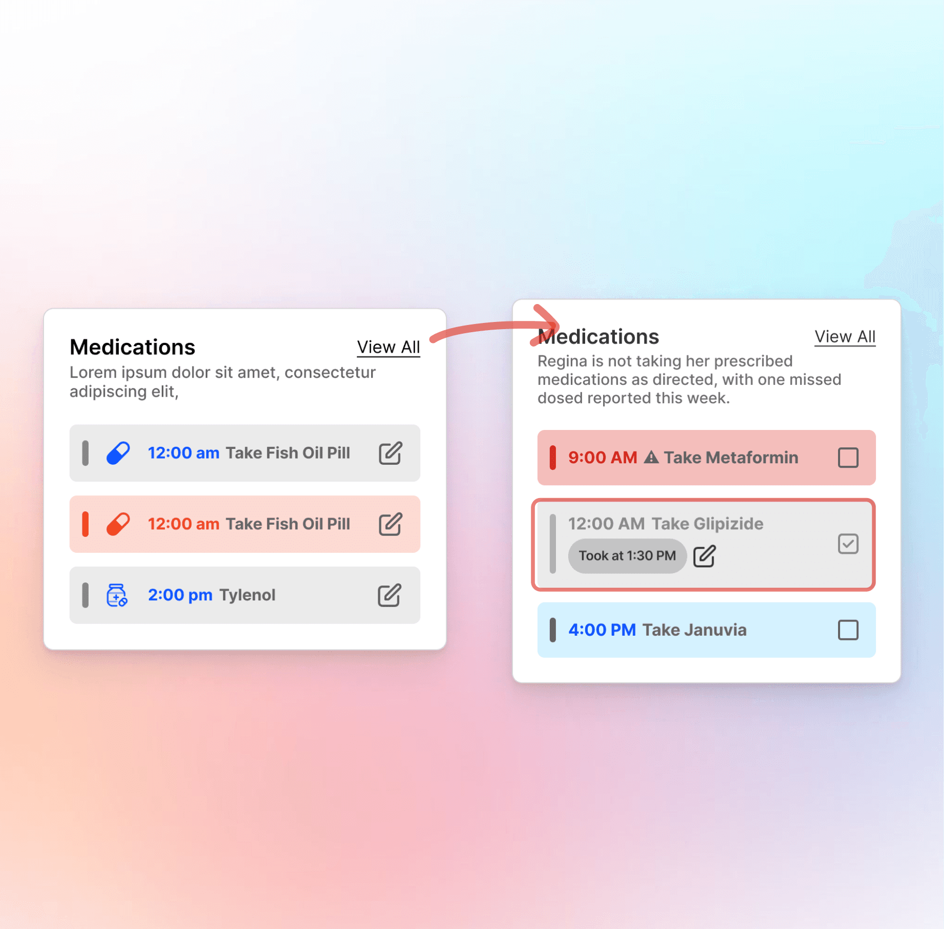
I reviewed the current onboarding, health profile, medication, and appointment flows to understand what the beta already supported and where shared care was not working.

One of four existing flows documented before redesigning the shared-care experience.

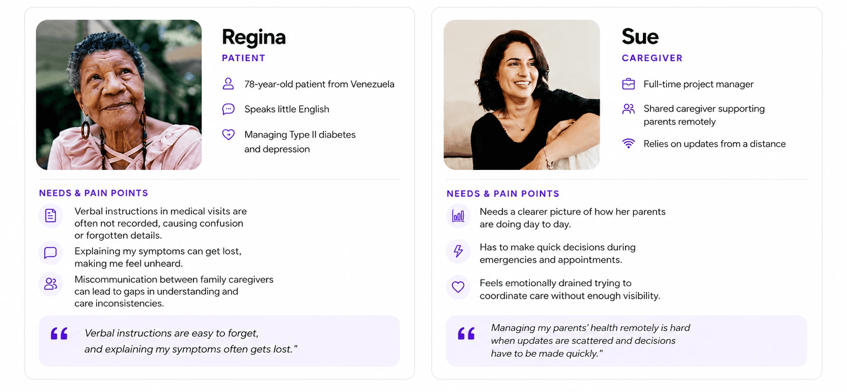
Who we were designing for

Two people managing the same care from different sides.

Design Principle: a feature had to help patients share information, help caregivers understand it, or make it easier for both to manage care together

Before

One user.
One record.

After

Multiple roles.
One shared system.

Need

Users needed access to their own health information as well as the records of people they supported.

Decision

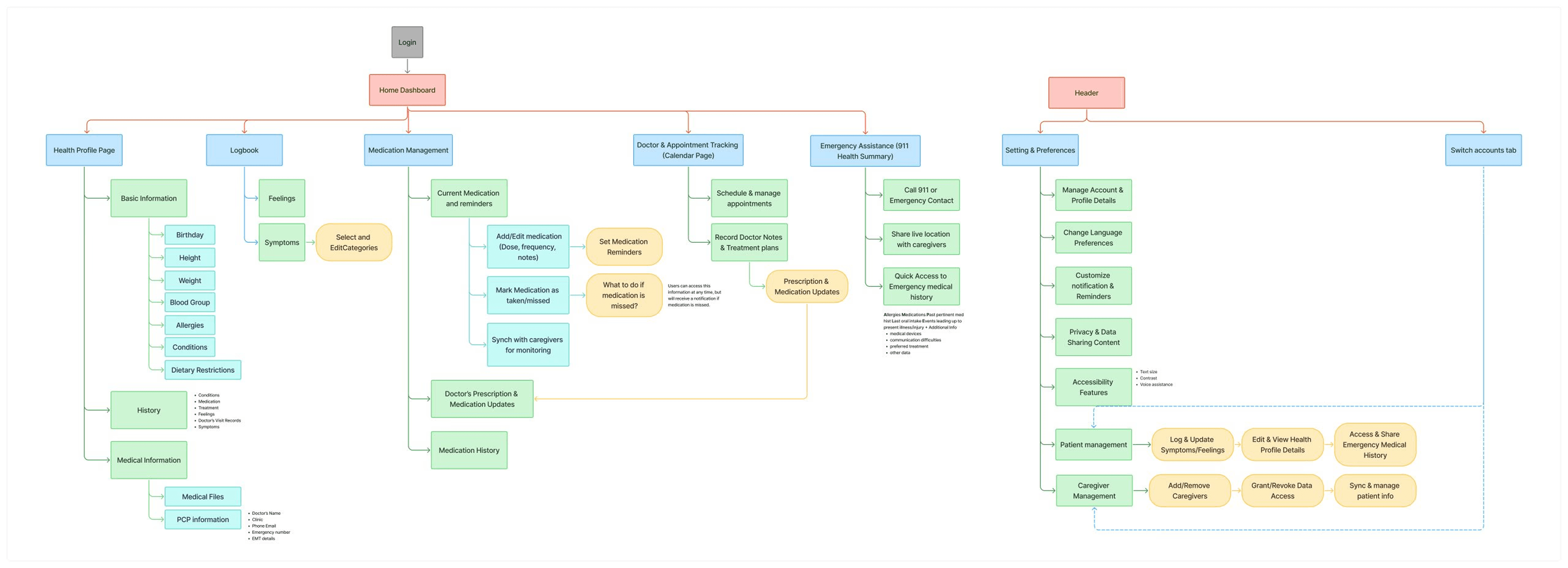
Use a multi-role structure with account switching and clear views for patients, caregivers, and supporters

Why

Separate experiences would make shared care harder to follow and force people to move between disconnected views.

Result
Navigation and access were reorganized around people and care relationships, not a single account.

Need

Patients needed a simple way to share symptoms and feelings without relying only on written medical language

Decision

Offer emoji for a quick check-in, voice for natural descriptions and photos for visible symptoms

Why

Long, clinical forms would make updates harder for older, multilingual and lower-literacy users

Result

Patients had more than one way to communicate a change in how they felt.

Making symptom updates easier to share

Health updates were often shared through calls or memory and could be incomplete or misunderstood

Homepage and care management

Explored how reminders, health records, medications, and appointments could work from one connected navigation system

Caregiver view and role switching

Explored how caregivers could review a patient's summary, switch profiles and still manage their own health.

Symptoms and feelings

Tested how patients could log recurring updates, review previous entries and share richer context.

Mid Fidelity

Turning the direction into testable flows

Before visual polish, we mapped the shared care experience across the homepage, health logging, and role switching. These mid-fidelity flows became the prototype used in usability testing.

The goal of this stage was no visual polish. It was to expose whether the role model, navigation, and logging structure made sense before committing to high fidelity.

Testing

Testing the mid-fidelity experience

We tested with three patients, three caregivers, and one participant who was both. The prototype showed us where the shared care model was clear and where it still broke down.

Obeserved

Account switching was not where users expected.

Caregiver tapped the patient's profile photo to change accounts

Placed switching at the profile the touchpoint.

I added across where users naturally reached, with a local confirmation before changing views.

Obeserved

Patient and caregiver information blended together.

Users were unsure whose care they were viewing and what each section represented.

Made role context visible in the page structure.

We separated "Check in on others" from "Check in on yourself" and strengthened ithe dentity crisis

  • Clarified whose care is being viewed

    Relationship-based headings and stronger profile cues replaced vague shared sections.

  • Aligned symptoms and feelings flows

    Both logging experiences were rebuilt around the same entry and history pattern.

  • Replaced clinical and unclear labels

    Terms such as "PCP information" were replaced with direct wording people could understand without guessing.


Final Design

How testing shaped the final experience

The final designs are shown after testing because they are the result of the changes above, not the starting point. Each screen reflects a specific product decision or usability finding.

Multimodal logbook

Patients can share updates through quick choices, voice, photos, and detailed entries

Homepage as the action hub

Reminders, health updates and contact actions are visible where users already start

Role aware care management

Caregivers can understand whose data they are viewing and move between profiles.

The decisions behind the screens

Instead of labeling every component, these annotations connect the final interface to what we observed during testing and the product choices that followed.

Use the homepage as the action hub

Participants repeatedly returned home to begin tasks. We brought reminders, logging and care contacts into one predictable starting point

Observed in testing

Keep the experience supportive, not clinical

Personalized greetings and caregiver messages add reassurance while keeping urgent health actions easy to find.

Tone decision

Reduce the effort of everyday updates

Recurring symptom choices and quick mood entry support frequent logging without forcing patients through the full form each time

Repeated use decision

Separate “their care” from “my care”

Clear relationship-based headings and identity cues show whether the caregiver is viewing the patient’s information or their own.

Role clarity

Summarize the patient before showing detail

Medication, symptoms and feelings are grouped into one current snapshot so caregivers can understand the situation before opening deeper records

Information hierarchy

Put account switching where users reached

A participant tapped the patient profile image when trying to switch. The final flow makes that profile touchpoint an explicit route to account switching

Observed behavior

Before

Today’s check-ins

After

Check in others/ Check in on yourself

What we did not do

We did not split patients and caregivers into separate apps. One role-aware product kept shared care connected while still making each person’s context clear.

Outcome

What we delivered

Use market research to narrow the brief

The competitive review was most useful when it helped us decide what not to build, rather than becoming a feature-comparison exercise.

Design roles as part of the interface

Multi-role products need more than account permissions. People need constant clarity about whose information they are viewing and what they can change.

Test relationships, not one isolated tasks

A longer pilot with real families would be the next step to understand whether shared visibility improves day-to-day coordination over time.

Delivery & Status

What we delivered

We presented a shared care direction for ERBuddy, demonstrated three tested flows, and handed the final architecture and design files to the client

3 Flows

Shared navigation, symptom and feeling updates, and account switching.

7 Sessions

Moderated usability testing that led to four design changes

Full handoff

Final information architecture, flows and design files delivered to ERbuddy.

Delivery & Status

What we delivered

What I would measure Next:

After launch, I would track whether caregivers can switch profiles successfully, whether patients complete health updates, and whether caregivers feel more informed about the patient’s current condition.

Psst! Are you on your phone?

This screen’s a bit too tiny for the full story.


Why can’t I see the full case study?!

Because your phone is too smol.

Why can’t I see the full case study?!

Because your phone is too smol.

👉🏼 Switch to a bigger screen for the real behind-the-scenes of this project full of messy sketches, big ideas, and some aha! moments.

Sakshi Rane

Product designer focused on complex systems, evidence-led decisions, and clear interaction design.

Contact

sakshirane.work@gmail.com

Sakshi Rane

Product designer focused on complex systems, evidence-led decisions, and clear interaction design.

Contact

sakshirane.work@gmail.com

Sakshi Rane

Product designer focused on complex systems, evidence-led decisions, and clear interaction design.

Contact

sakshirane.work@gmail.com