

Project Type
User Research, Eye Tracking Study, Usability Testing
My Role
UX Researcher
Project Timeline
4 Month
Scope
Think-Aloud Protocol, SUS, Heuristic Evaluation
Software Used
Tobii Pro X2, Tobii Pro Lab, Adobe Premier, Figma
SVA’s Research Guides
The School of Visual Arts (SVA) is a art school with a wide array of online resources tools and archives aimed to supporting the needs of art and design students. However, user feedback indicated that these platforms despite being rich in content were difficult to navigate, lacked visual clarity, and didn't align with students' natural browsing behaviors.
To address this, our team was brought in to evaluate and enhance the usability of these digital tools through eye-tracking, usability testing and heuristic evaluation.
Problem Statement
The SVA Library was overwhelmed with repetitive queries and needed a more intuitive way for users to access help on their own. While research guides existed, they were underutilized—mainly because the library lacked insight into how students actually navigated the site.
How might we make it easier for students to find the right resources in research guides?
Our Team
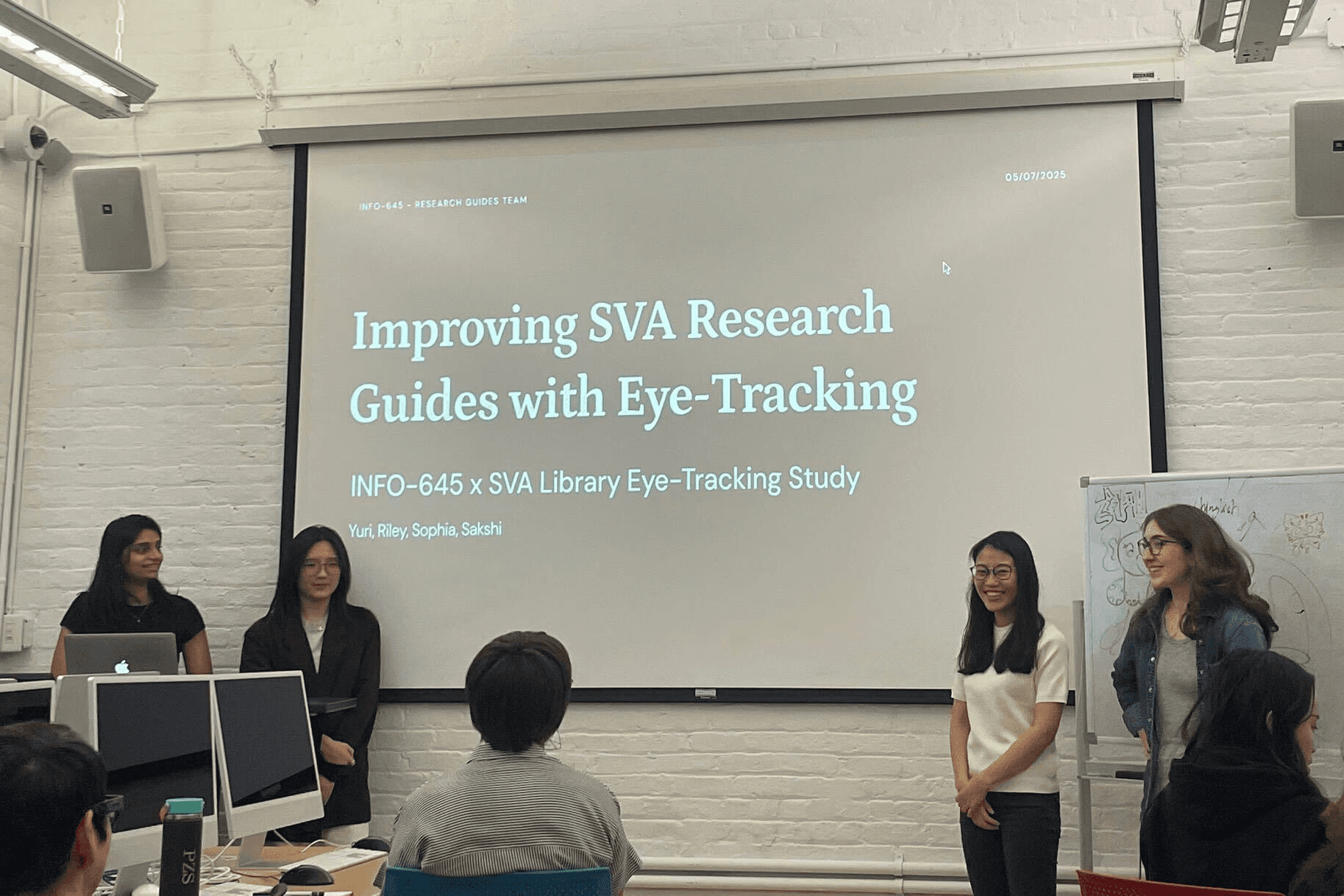

Sakshi Rane (ME!), Sophia Liu, Yuri Minami, Riley Knowles
Three Pronged approach
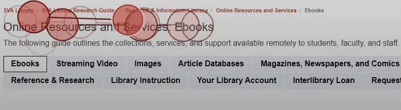
Eye-Tracking for Task Completion
Eye Tracking
Survey
System Usability Scale (SUS)
+42%
Deeper insights and inform solutioning.
We tested these two sections to learn how students use them and find ways to improve the experience.
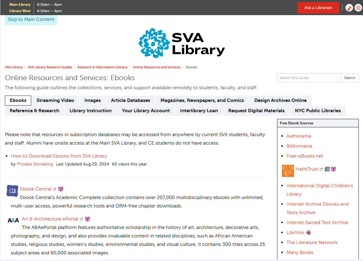
Online Resources
This is the go-to page for SVA students, and because it’s where most people land first, it has the biggest chance to make an impact.
Scenario
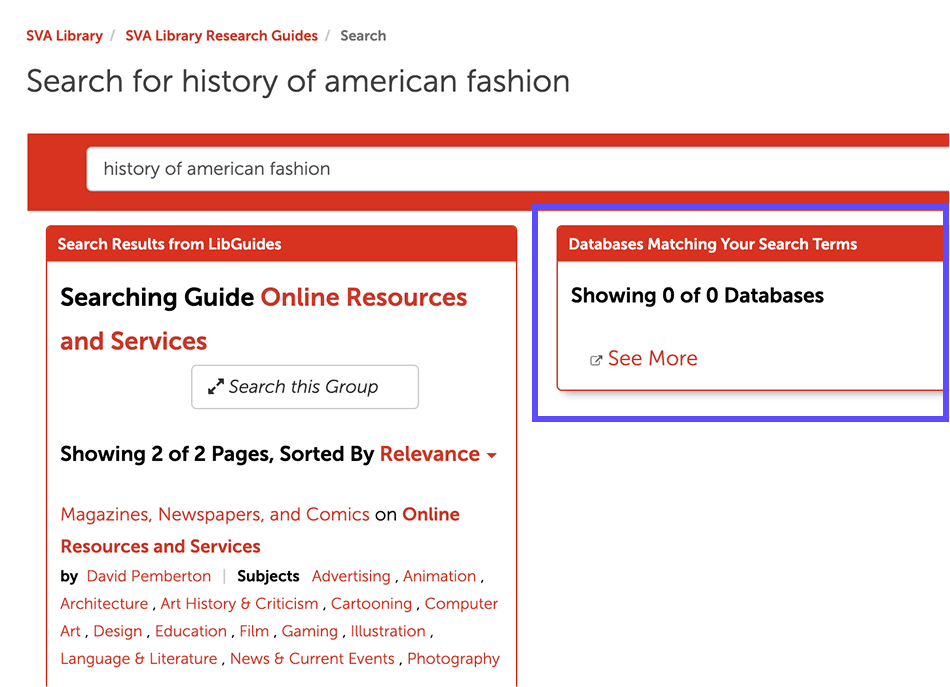
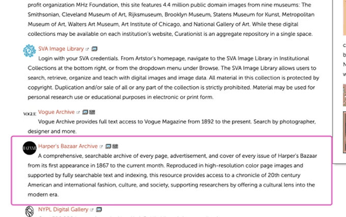
Imagine you are a student writing a paper on the history of American fashion.
Task
Find resources you could use to source fashion magazine photos to serve as the topic of your paper.
Research Question
How effectively and quickly can users understand the purpose of SVA research guides and what they can do with them?

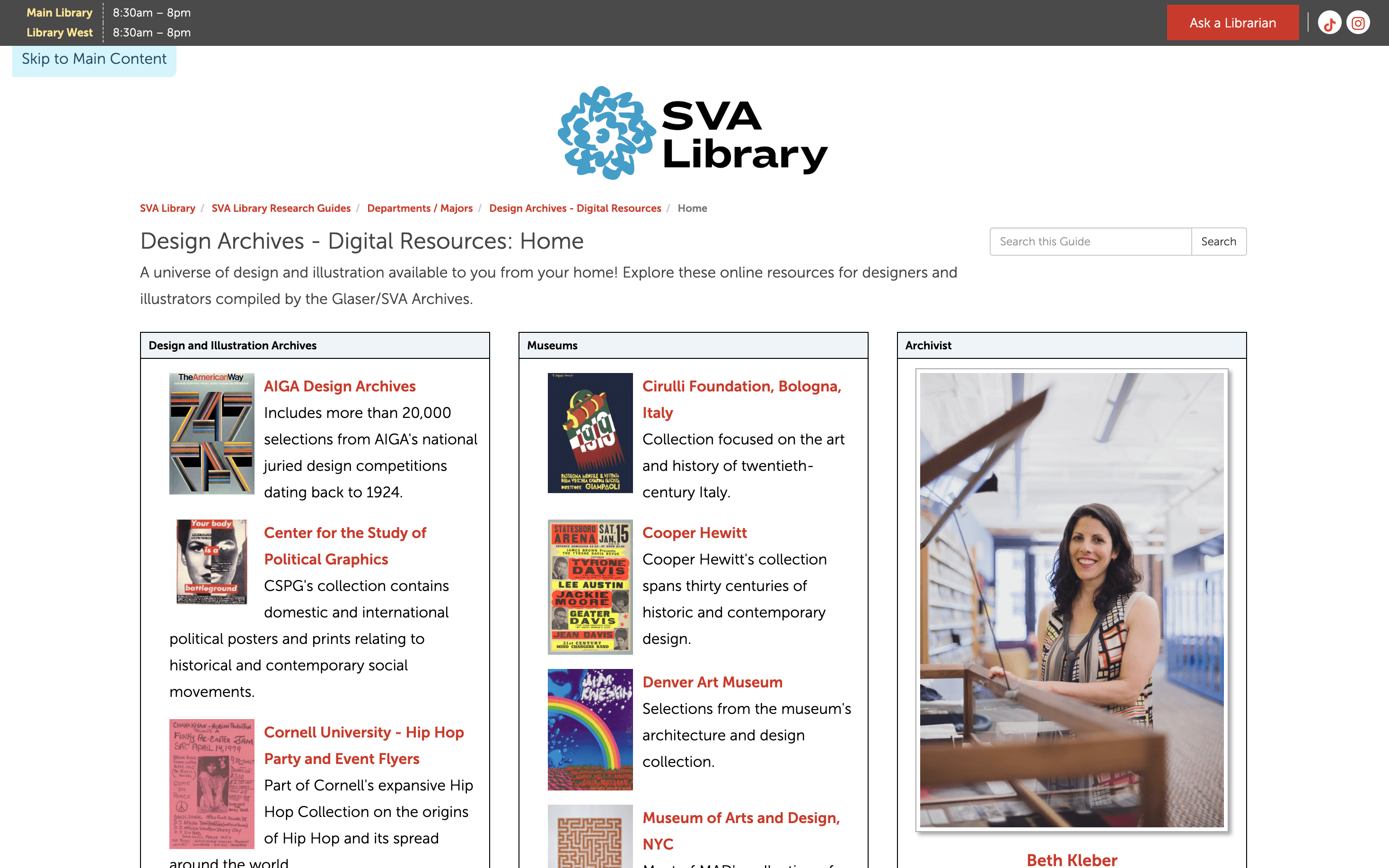
Design Archives
This page lists design archive resources and was chosen by the client as the key template for broader use.
Scenario
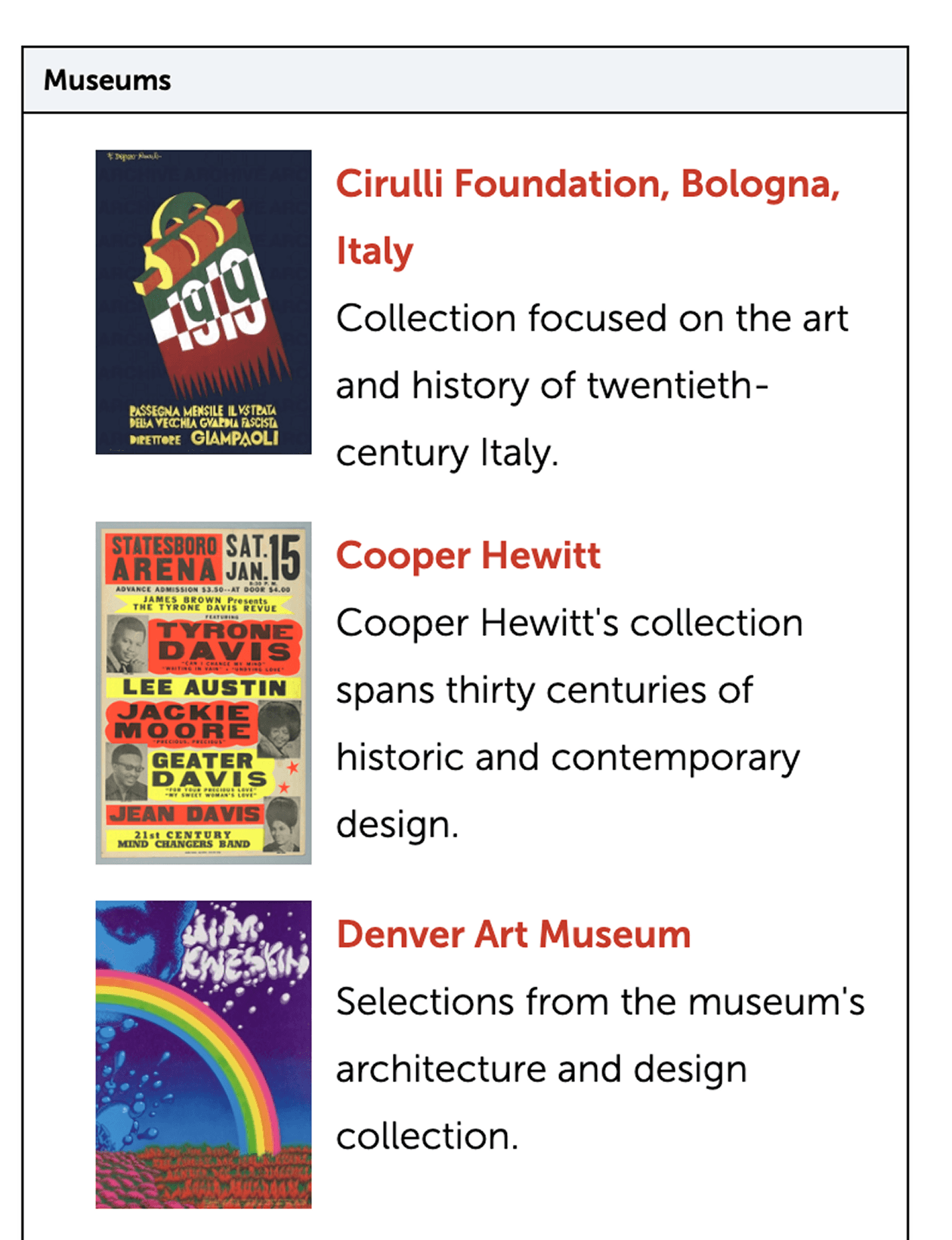
Imagine you are a graphic design student designing a movie poster.
Tasks
Explore the page to find suitable typography resources for your project.
Research Question
What’s the best way to organize research guides so they’re clear and easy to navigate?


What Clients said
“Great recommendations from this group for reducing item and database descriptions on our guides, and for a better way to organize content on the exemplary guide, Design Archives. We can use these suggestions to apply system-wide updates to all of our guides.”
— Digital Services Librarian, SVA Library
What I Took Away
This project helped me get better at turning research into simple, clear stories. By combining numbers, user behavior, and quotes, I learned how to explain what users need in a way that makes sense to everyone. Putting these pieces together made it easier to show the real problems and get stakeholders to trust our recommendations. I’ll keep using this skill as a product designer to share insights and make better decisions for users.
